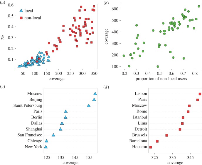
Figure 5.
Relation between local and non-local users. (a) Scatter-plot of  as a function of the coverage for locals (blue triangles) and non-locals (red squares). (b) Coverage as a function of the proportion of non-local Twitter users. (c) Top 10 ranking cities based only on local users according to the coverage. (d) The same ranking but based only on the movements of non-local users. In all the cases, the number of local and non-local users extracted is u = 100 for every city and all the metrics are averaged over 100 independent extractions. (Online version in colour.)

