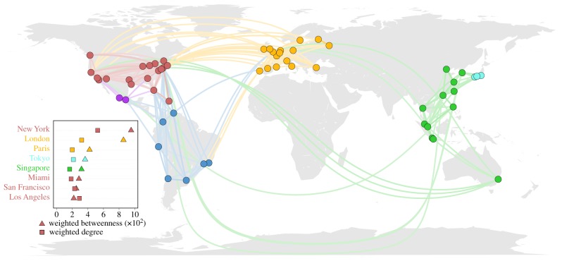
Figure 7.
Mobility network. Local Twitter users’ mobility network between the 58 cities. Only the flows representing the top 95% of the total flow have been plotted. The flows are drawn from the least to the greatest. The inset shows the top eight cities ranked by weighted betweenness and weighted degree.

