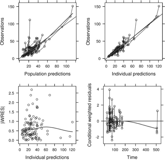
FIG 1.
Goodness-of-fit plots for the final population PK model. (Top left) Plot of observed meropenem concentrations versus population predictions. Solid thin line, line of identity; solid thick line, data smoother. (Top right) Plot of observations versus individual predictions. Solid thin line, line of identity; solid thick line, data smoother. (Bottom left) Plot of individual weighted residuals (iWRES) versus individual predictions. Thick line, data smoother. (Bottom right) Plot of conditional weighted residuals versus time. Solid thin line, zero slope line; solid thick line, data smoother. Predicted concentrations are in milligrams per liter; time is in hours.

