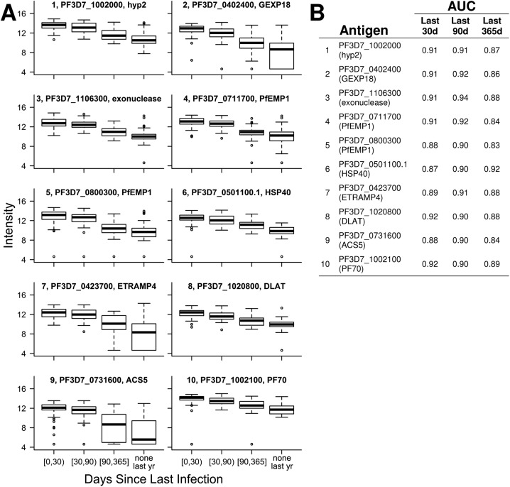
Fig. S1.
(A) Intensity of antibody responses to the top 10 Pf antigens predicting days since last infection decreases over time. Each boxplot’s title indicates rank, gene identification, and annotation. (B) Days since a participant was last infected with Pf were estimated from linear models that included microscopy and responses to one of these top 10 antigens as covariates. Based on these predictions, ROC curves classified whether individuals were infected within the last 30, 90, and 365 d. Areas under the curve (AUCs) were calculated for each ROC curve.

