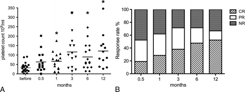
FIGURE 1.

Platelet count response before and after RTX treatment. A, Box plots show the 25th and 75th percentiles. Horizontal black solid lines within boxes indicate medians; filled circles indicate means. Vertical bars indicate the fifth and 95th percentiles. *P < 0.05 as compared with levels before treatment. B, The overall response during follow-up. Each column represents response rate at a particular time point. NR indicates NR.
