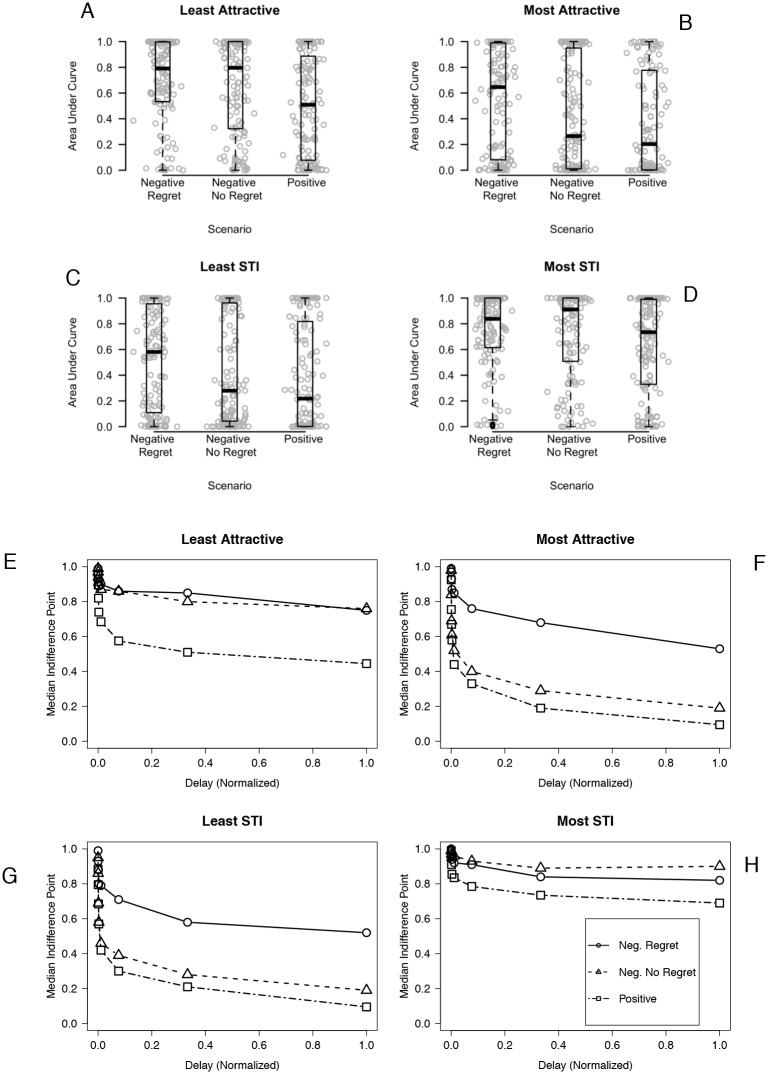
Fig 1. AUC values for each partner condition by scenario depicted two ways.
In panels A—D, dots represent individual discounting sessions, and boxplots provide the minimum, maximum, first and third quartiles, and median. Points are horizontally jittered (i.e., a small amount of random noise is added) to enhance visibility. In panels E—H, median indifference points for each delay to condom-protected sex are represented for each scenario by partner condition.

