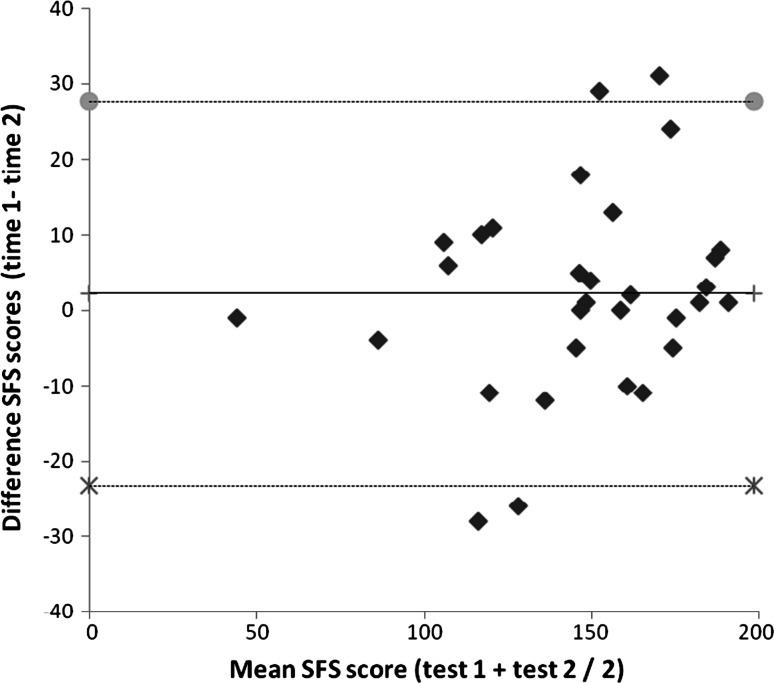
Fig. 2.
Bland-Altman plot of the SFS scores. The middle line represents the mean difference between the two tests. Gray circle represent the upper and cross symbol represent lower limit of agreement, i.e. mean difference + 1.96 SD of the differences and mean difference − 1.96 SD of the differences, respectively. An outlier with a difference in SFS scores of 62 is not shown

