
Figure 1.
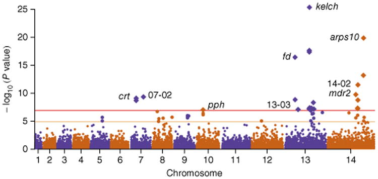
Manhattan plot showing the significance of SNP association in the GWAS. Each point represents 1 of the 18,322 SNPs with MAF > 0.01 in a set of 1,063 samples, colored according to chromosome. The x axis represents genomic location, and the y axis represents the P value for the SNP's association calculated using a linear mixed model (Online Methods). SNPs with P ≤ 1 × 10⁻⁷ after Bonferroni correction (n = 24; above the horizontal red line) are represented by diamond symbols. The nine loci containing these SNPs are identified in the plot and listed in Table 2. Polymorphisms with association P ≤ 1 × 10⁻⁵ (n = 24) are shown in a larger size between the horizontal orange and red lines and are listed in supplementary table 2.