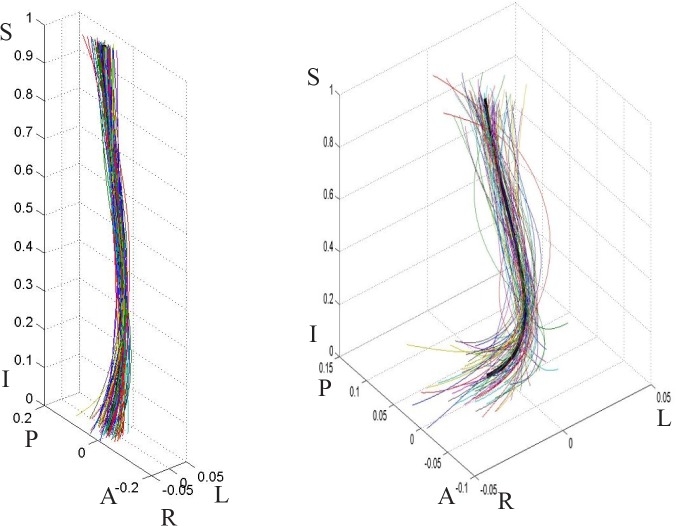
Fig 5. Male population curves, 3-D view.
The graph on the left is scaled to the axes proportions; the graph on the right is freely scaled to arbitrary proportions for a better view of the curve shape. Each line represents a curve sample. The solid black line in the middle is the model curve. The coordinates are scaled by the vertical distance between the superior end plate of the sacrum and the inferior end plate of T12.

