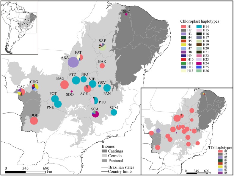
Figure 1.
Geographical distribution of haplotypes. Different colors were assigned for each haplotype according to the figure legend. The circle size represents the sample size in each population and the circle sections represent the haplotype frequency in each sampled population. For details on population codes and localities see Table S1 in Appendix S1.

