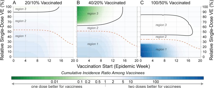
Fig 6. Comparison of individual- and population-level benefits of one- and two-dose campaigns by vaccination start time and relative single-dose efficacy.
Colors in each panel represent the cumulative incidence ratio, comparing cumulative incidence among those ever receiving vaccine in one-dose campaigns (numerator) with the cumulative incidence among those ever receiving vaccine in two-dose campaigns (denominator). Solid lines in each panel outline the region where single-dose campaigns are better for vaccinees (a result of indirect effects). Dashed lines represent the population-level threshold above which overall cumulative incidence is lower in a one-dose campaign compared to a two-dose campaign. Panels illustrate settings where enough susceptibility-reducing vaccine is available to cover (A) 20%, (B) 40%, and (C) 100% of the population with a single dose. In each plot, region 1 corresponds to the area where two doses are better for both the vaccinees and population, region 2 is where one dose is better for the population but not the vaccinees, and region 3 is where one dose is better for vaccinees and the population. Similar plots for different forms of vaccine protection are shown in S4 Text. VE, vaccine efficacy.

