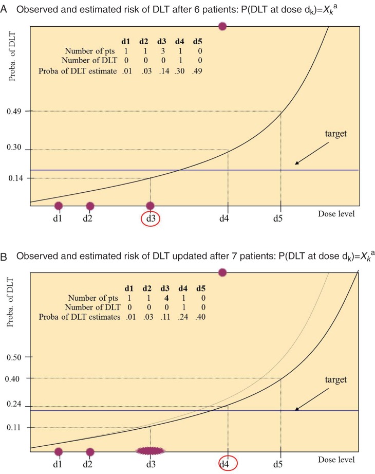
Figure 1.
Estimated dose–DLT curves in a simulated trial with five dose levels (d1–d5) after patients 6 (black line in A and B) and 7 (gray line in B). Dark gray (red online) dots represent the proportion of DLT at each dose level (empirical frequencies), the black (blue online) line corresponds to the targeted percentile of the dose–toxicity relation (20%); circled doses are the doses closest to the target, corresponding to the best current estimate of the MTD; this dose is recommended for the next patient.

