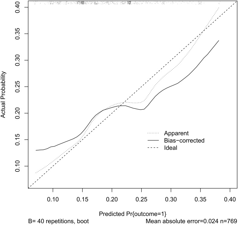
Fig 4. Observed and predicted treatment failure.
The dotted line plots the observed vs. predicted probability of treatment failure the solid line is a bias-corrected version (40 bootstrap repetitions). The rug plot along the top of the graph indicates the distribution of the predicted probabilities.

