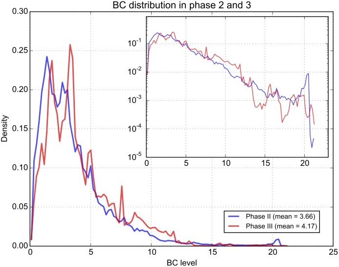
Fig 6. Overall pollution levels compared between the two phases.
The distribution of BC levels are shown for the two measuring phases of the challenge. The vertical axis shows the density, i.e. the normalised frequency of the various BC levels measured, so that the area under the plot is 1. The inset shows the same plot but with a logarithmic vertical axis, to emphasize the tail of the distribution.

