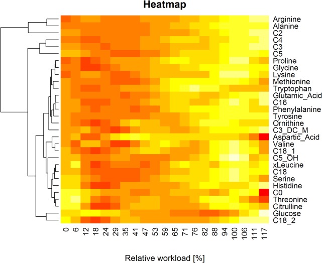
Fig 8. Heatmap.
Colored heatmap, visualizing the results of hierarchical cluster analysis. Concentration values are scaled and centered for each metabolite by row, resulting in an improved color representation. Relative workload values (x-axis) are visualized in linear order, resulting in a colored representation of the polynomially fitted concentration curves for each metabolite.

