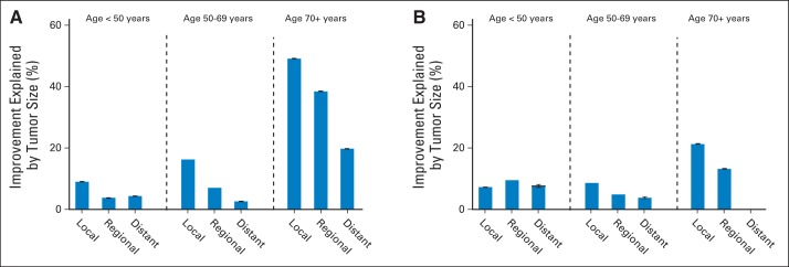
Fig 2.

Percent improvement in breast cancer–specific death hazard ratios explained by stratification on tumor size. Data are shown for each combination of age group and stage at diagnosis: (A) 2005 to 2010 is compared with 1973 to 1979 for the first 5 years after diagnosis, and (B) 2000 to 2004 is compared with 1973 to 1979 for the period after 5 years after diagnosis. At the top of the bars, 95% CIs are indicated; no bar is shown if the CI includes zero.
