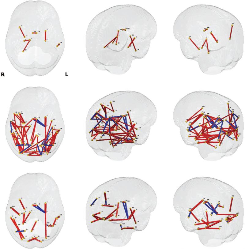
Figure 7.
Significant group differences (controlled for age and sex) from AD vs. control connection analysis using FA. Those connections with p-values that survive multiple comparisons correction are exhibited. The thickness of each connection represents the p-values in – log 10 scale (thicker connection corresponds to lower p-value), and the color of each connection represents the direction of the difference (red: stronger in controls group, blue: stronger in AD group). The region indices are given in Tab.3. Left column: top view, Middle column: upper-left view, Right column: upper-right view. Top row: result from GLM on raw FA values and Bonferroni thresholding at 0.01, Middle row: result from MGLM on WaCS and Bonferroni thresholding at 0.01, Bottom row: result from MGLM on WaCS and Bonferroni thresholding at 0.001. We can observe from the top two rows that the WaCS approach yields more sensitivity to significant connection.

