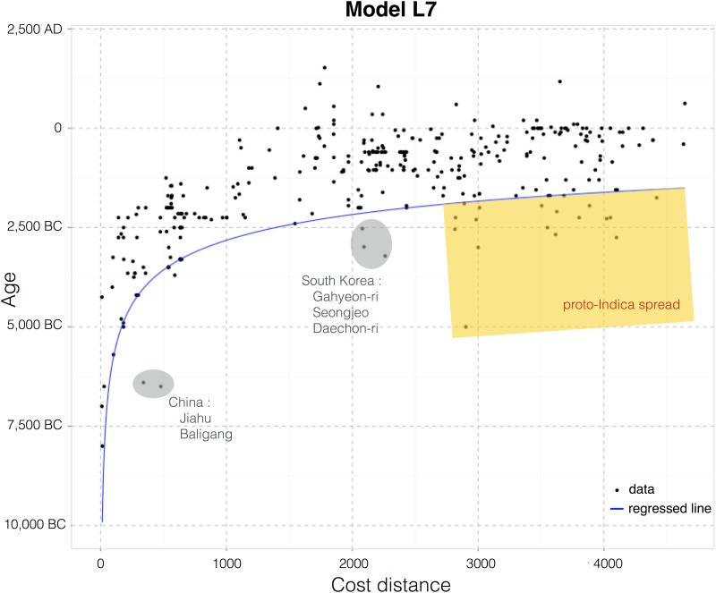
Fig 9. Scatterplot of the dataset for the best-fitting model L7.
The quantile interpolation of the 10th-percentile of the data (blue line) shows that the distribution follows a power law rule. Sites earlier than the model are circled and identified (see the text for related discussion).

