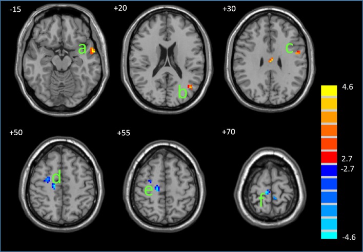
Fig 3. Differences in the functional connectivity between the PMS and control groups.
The statistical map was derived from a two-sample t-test of DMN components. The red and blue color denote, respectively, the regions showing increased and decreased functional connectivity in the PMS compared with the controls. a, MTG/STG; b, PHG; c, MTG; d, precentralgyrus; e-g, MFG. The bar at the right shows T-values. Images are in radiologic format with the left side of the image corresponding to the right side of the subject’s brain.

