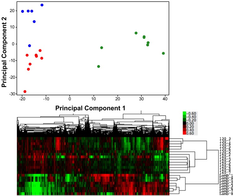
Fig. 1.
Top: principal component plot showing the distribution of gene expression in cardiac septum along the first 2 principal components of the variance in the data identified in the unsupervised analysis of the normalized, background corrected gene expression levels detected on the microarrays. 130-days gestation = blue, term = red, and 2 wk old = green circles. Bottom: heat map representation of the unsupervised gene expression data for each animal, the closer their data are on the y-axis, the more closely related their gene expression levels. 130_1 through 130_6 are the 6 130-day gestation samples, 140_1 through 140_8 the 8 term samples, and Lamb_1 through Lamb_8 are the 2-wk-old samples. The colored scale for the heat maps, bottom right, shows the fold change in expression levels of the gene from the normalization point, where green is decreased, and red increased, expression.

