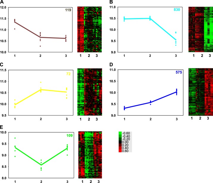
Fig. 3.
The 5 panels of this figure show on the left a graph of the average gene expression of all the genes identified in a pattern (colored line) of gene expression for each animal in the time point sampled (colored symbols), and on the right, the heat map showing the relative expression level of each gene in each animal. 1 = 130-days gestation (n = 6); 2 = term (n = 8); and 3 = 2-wk-old (n = 8). Expression pattern A = brown, B = turquoise, C = yellow, D = blue, E = green. The number in the top right of each graph is the number of genes identified in each expression pattern. The colored scale for the heat maps, bottom right, shows the fold change in expression levels of the gene from the normalization point, where green is decreased and red increased expression.

