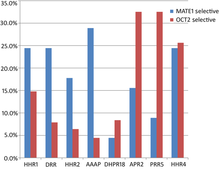
Figure 4. Histogram to compare the distribution of MATE1 selective, OCT2 selective and dual inhibitors in matching hypotheses.

MATE1 selective inhibitors and OCT2 selective inhibitors are colored by blue and red, respectively. Bars show the percentage of particular inhibitors matching each pharmacophore hypothesis.
