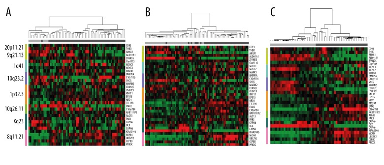
Figure 3.
Three studies (data sets 2, 3, and 4, shown in Table 1) demonstrate the hierarchical clustering of the sample expression profiles (A, B, and C, respectively). Columns represent the samples, and rows represent the genes. The colored bar at the left represents the regions: 20p11.21 (yellow-green), 9q21.13 (light green), 1q41 (light blue), 10q23.2 (purple), 1p32.3 (orange), 10q26.11 (emerald), Xq23 (dark green) and 8q11.21 (pink). Standardized gene expression values are displayed as colored boxes; red=high; green=low. The horizontal bar at the top indicates the classification of the samples: gray=normal; black=cancer.

