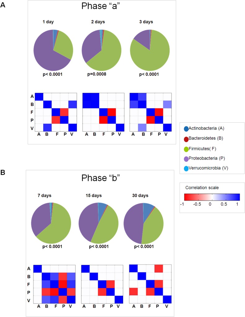
Fig 2. Pie chart representing phyla taxa median values for 30 days following birth.
Statistically significant differences in relative abundance at each time point are reported below each graph (Kruskal-Wallis). Phyla correlation heat maps. Correlation levels (represented as colored squares) among phyla were calculated by Pearson’s test for all 6 time points. Only squares with a significance p<0.05 are shown. Blue squares represent a positive correlation and red squares represent a negative correlation. Panel A and Panel B report analyses for 1–3 days (phase “a”) and 7–30 days (phase “b”), respectively.

