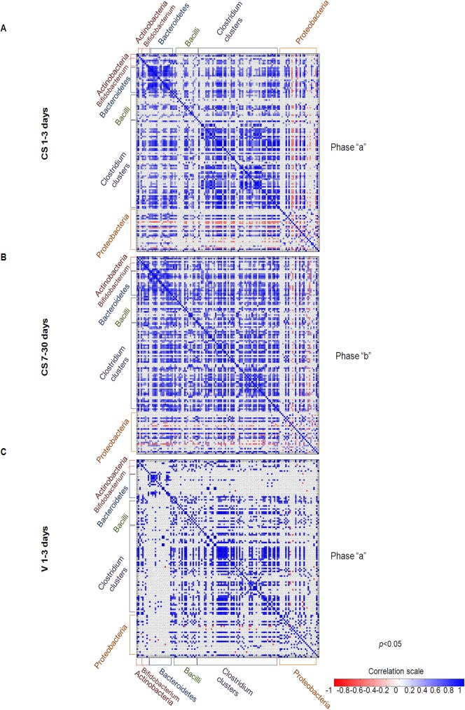
Fig 3. Pearson’s correlation heat maps for the 130 genus-like groups from the HITChip microarray.
Panels A, B, and C show the correlation levels (represented by colored squares) among groups, which were calculated by Pearson’s test for all 3 groups (CS-delivered 1–3 days, CS-delivered 7–30 days, and V1-3 delivered days). Only correlations with a significance p<0.05 are represented. The colored scale indicates the correlation values.

