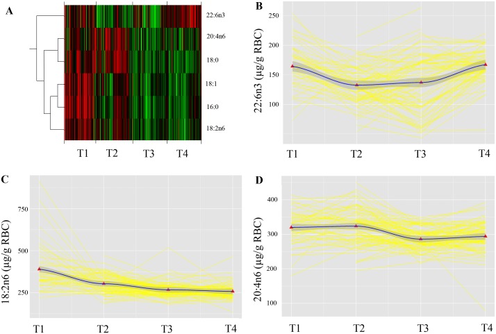
Fig 2. Repeated measurements of RBC FA status from pregnancy until 12 months postpartum.
Panel A shows a heat map visualizing the abundance values of the FA across the repeated measurement. Red represents higher values and green represent lower values. A dendrogram on the left hand side of the heat map indicates similarity in the change over time in abundance profiles. Panel B, C and D represent raw data (yellow) of individually growth trajectories for B: 22:6n3 in RBC (μg/g); C: 18:2n6 RBC (μg/g); and D: 20:4n6 RBC (μg/g), measured in the 28th gestational week (T1) and 3- (T2), 6- (T3) and 12 months (T4) postpartum. The black lines are locally weighted regression (lowess) lines that “smooth” the overall variability in each of the three datasets and provide an unbiased glimpse of the average trend in the data. The red triangles represent the population mean at each timepoint. T1 (28th gestational week), T2 (three months postpartum), T3 (six months postpartum), T4 (twelve months postpartum).

