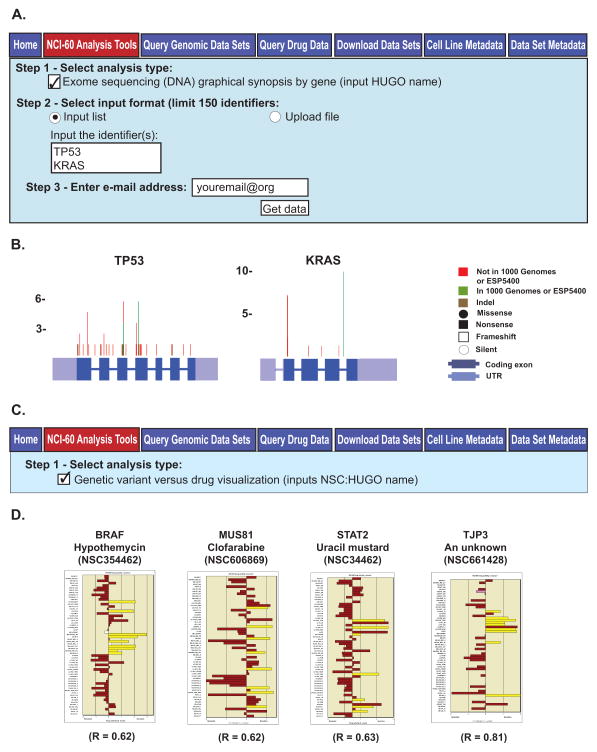
Figure 3.
The “Exome sequencing (DNA) graphical synopsis by gene” and “Genetic variant versus drug visualization” tools. A. The “Exome sequencing (DNA) graphical synopsis by gene” tool. To access this tool, click on the “NCI-60 Analysis Tools” tab, followed by the “Exome sequencing (DNA) graphical synopsis by gene” check box. Use gene HUGO names as input, to a maximum of 150. Data receipt is done as in Fig. 2A. B. The composite images for the TP53 and KRAS inputs. The gene exons, UTRs and genetic variant locations, number and types are as indicated. C. The “Genetic variant versus drug visualization” tool. To access this tool, click on the “NCI-60 Analysis Tools” tab, followed by the “Genetic variant versus drug visualization” check box. Select input as NSC:HUGO name pairs, to a maximum of 150 (pairs). Data receipt is done as in Fig. 2A. D. The bar graph output for four NSC:HUGO name pairs are shown. The x-axis is the drug activity z score. The y axis is the cell lines. Brown filled bars indicate that the cell line has no variants that contribute to a statistically significant shift in drug activity. The yellow filled bars indicate that the cell line has variants that contribute to a statistically significant Pearson correlation to the selected drug. “R” is the correlation value between the presence of variants and shift in drug activity.

