
Fig. 1.
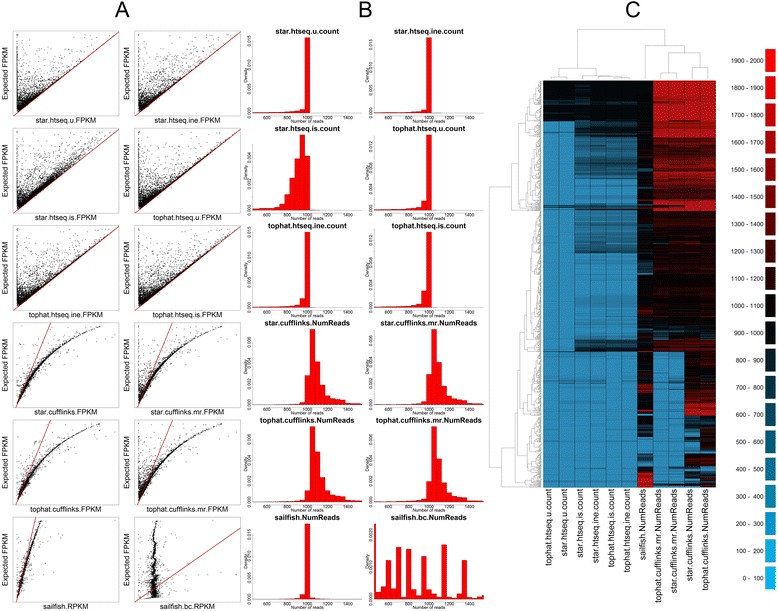
Comparison of methods on global simulated data. a Scatter plots comparing FPKM for each of the 12 methods against the known FPKM from simulated data. The red line indicates the y = x line. b Histograms of read counts for each of the 12 methods. All methods should have a single peak at 1000. c A heatmap of read counts from 843 grossly underestimated genes and 187 grossly overestimated genes. Black and darker colours indicate read counts close to 1000 (accurate); green colours indicate underestimation and red colours overestimation