Figure 3.

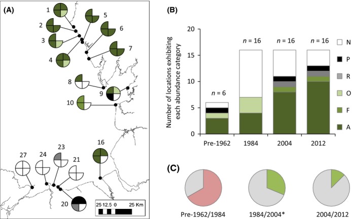
(A) Spatiotemporal comparison of distribution and abundance of Sabellaria alveolata across long-term survey locations (St. Bees Cumbria to Penmon, Anglesey). See Table3 for explanation of survey location numbers. Each quadrant of the pie chart represents a survey: top right = pre-1962 (from Cunningham et al. 1984 and Crisp and Southward unpublished notebooks); bottom right = 1984 (from Cunningham et al. 1984); bottom left = 2004 (from Frost et al. 2004); top right = 2012 (collected by authors). No data available for some locations in 1962 (denoted by empty quadrant). See legend for color coding. A = abundant; C = common; F = frequent; O = occasional; R = rare; P = present; N = not seen. (B) Comparison of the relative proportions of each abundance category among sampling periods: Six locations were sampled in pre-1962 and 16 locations were sampled in 1984, 2004, and 2012. (C) Pie charts illustrating the comparison of the proportion of locations exhibiting no change (gray) and decreased abundances (pink) and increased abundances (green) among paired sampling periods: pre-1962/1984; 1984/2004, and 2004/2012. *P < 0.05.
