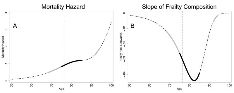
Figure 1.
Deceleration Intervals in Example Cohort. The left column gives the mortality hazard and the right column gives the slope of the frailty composition (the negative rate of mortality selection), both over age. The dashed dark lines represent Gompertz mortality; the thick grey lines, absolute deceleration; and the thick black lines, relative deceleration. The dashed light vertical line marks the point where the frail become a minority.

