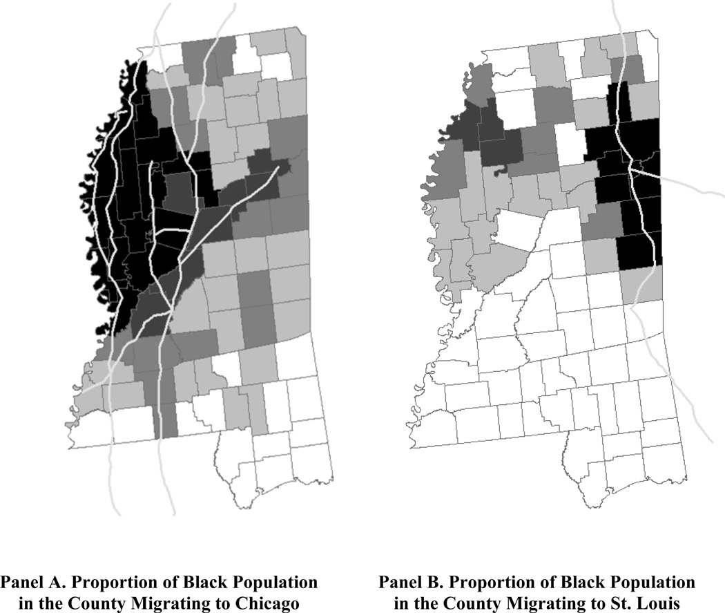
Figure 3. Migration of Blacks from Mississippi Counties along the Illinois Central to Chicago and from Mississippi Counties along the Mobile and Ohio to St. Louis.
Source: Authors’ calculations from the Duke-SSA data, birth cohorts 1916 through 1932. In Panel A the proportion of the black population in a county migrating to Chicago is indicated by shading, from light to dark: <0.10, 10–0.14, 0.14–0.18, 0.18–0.22, and >0.22. Also in Panel A the Illinois Central line is highlighted. In Panel B the proportion of the black population in a county migrating to St. Louis is indicated by shading, from light to dark: <0.04, 0.04–0.06, 0.06–0.08, 0.08–0.10, and >0.10. Also in Panel B the Mobile and Ohio line is highlighted.

