
Figure 5.
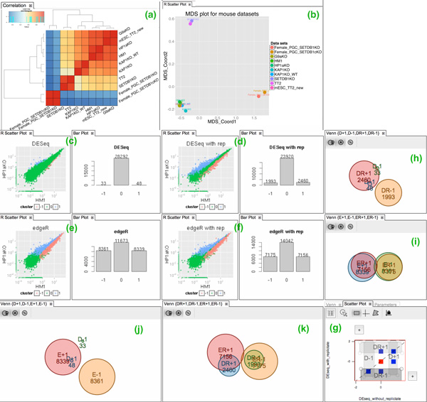
Workflow of gene expression analysis in case study 1. (a) Heat map with dendogram plot, and (b) MDS plot, showing the transcriptional correlation. (c-f) scatter and bar plots showing the genes up-regulated (blue color and labeled "1"), down-regulated (red color and labeled "-1") or non-differentially expressed (green color and labeled "0") based on DESeq and edgeR Apps with replicates ("DR" and "ER", respectively) or without replicates ("D" and "E", respectively). The results for pair-wise comparison of DR, ER, D, and E runs have been shown as Venn diagrams for up-regulated and down-regulated genes. (g) Native scatter plot app showing the intersection between the result of DR (DESeq with replicates) and D (DESeq without replicates) runs for up ("1") vs. down ("-1") regulated genes. The rectangle filter in native scatter plot is used to create the four subsets for Venn diagrams (h-k).