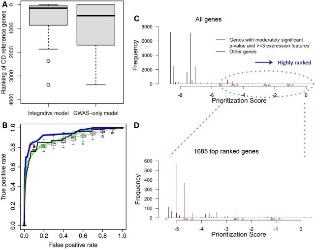
Figure 3.
Performance of the integrative model. (A) Boxplot ranking of 54 CD reference genes comparing the integrative model and GWAS-only model. (B) ROC curves of four regression models. Blue curve: full integrative model. The red cross at the inflection of the ROC curve, corresponds to the cut-off of the top 1685 genes. Black curve: GWAS-only model. Green curve: model with all predictors except for GWAS P-value. Gray curve: model with randomization of all predictors except GWAS P-value (box plots along the gray line reflect the variation observed in the randomization analyses). Distribution of integrative model prioritization scores for all human genes (C), and for the top 1685 ranked genes (D). Red carets indicate scores of genes with nominally significant GWAS P-values and three or more expression features.

