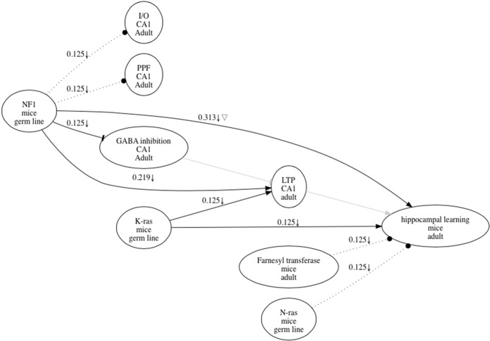
Figure 1.
Research map representing results in a published paper (Costa et al. 2002). Each node in the graph has three items that describe the name of the item (top), as well as spatial (middle) and temporal (bottom) information that defines it. Nodes are connected by edges that characterize the nature of the causal relations represented, including excitatory (sharp edges), inhibitory (dull edge), and no relation (dotted line). Each edge also has a score that reflects the amount of evidence represented, and symbols that reflect the types of experiments carried out, including upward arrow for Positive Manipulations, downward arrow for Negative Manipulations, and triangle for Mediation Experiments (see text for definitions). Edges representing key hypothetical information mentioned in the article are represented as thick gray lines; since these edges are hypothetical, they have no weights or experimental symbols. The weights or scores of the edges in the map were determined according to the following simple rules; any one of the four types of experiments described in the text was given a score of 0.125. Additional experiments of the same type were scored according to a geometric progression with a start term of 0.125 and r factor of 0.5. For example, the first negative manipulation and mediation experiments supporting a causal connection between NF1 and LTP (long-term potentiation) in the graph contributed each 0.125 weight. The second negative manipulation contributed 0.125 × 0.51 or 0.6025. Thus, adding the scores of these three experiments, we derived the rounded up score of 0.313 shown above the NF1-LTP edge. Contradictory evidence, when available, would detract from the score of that edge.

