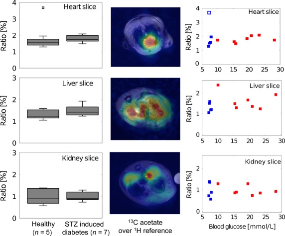
Figure 4.

ALCAR/acetate ratio in healthy and diabetic rats. The 1st column shows boxplots containing median, 25 and 75 percentiles as well as the maximal and minimal value for each slice. The 2nd column illustrates an example of the acetate distribution in the three slices. In the 3rd column the ratio is plotted versus the blood glucose concentration for the healthy (blue) and the diabetic (red) animals.
