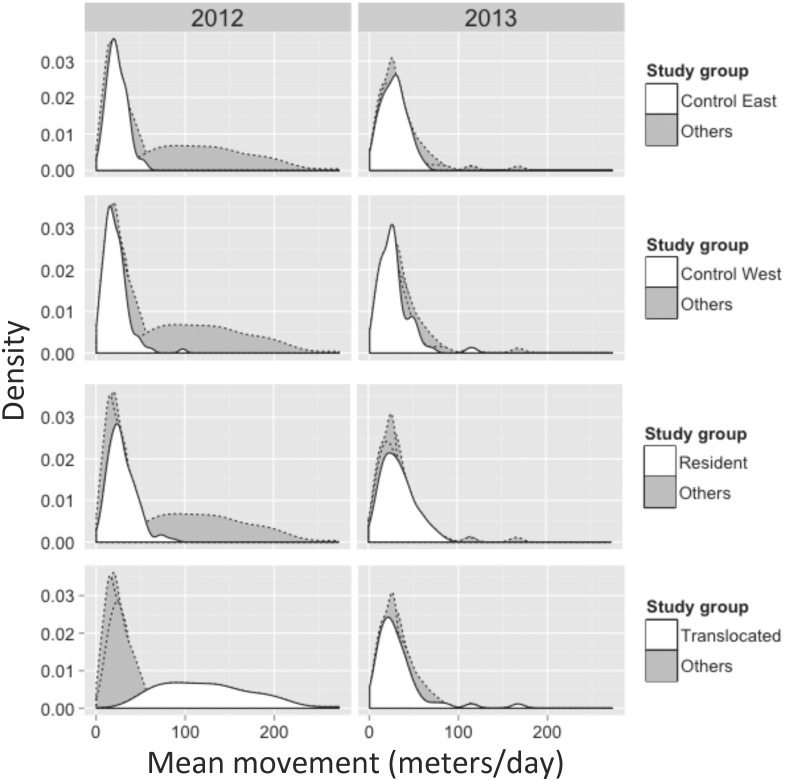
Fig 3. Density plots of the distribution of time-scaled distances (in meters; adjusted for days between subsequent encounters) for tortoises monitored during the 2012 (left column) and 2013 (right column) active seasons (approximately April through October).
The distributions shown in white in each row represent one of the four study groups (indicated by the legend for each row) while shaded distributions represent all other groups. Note the difference in distributions between the 2012 translocated tortoises (lower left panel) versus all other study groups in both years.

