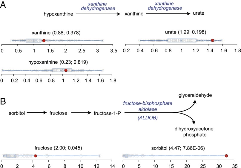
Fig. 4.
Assessment of the metabolic perturbations defined biochemical pathways. (A) Purine degradation pathway and dot plots showing data distribution in the cohort for xanthine, urate, and hypoxanthine. The red dots show the metabolite level for volunteer 3923. The open dots show the data distribution for the rest of the cohort (n = 80). (B) Sorbitol degradation pathway and dot plots showing data distribution in the cohort for fructose and sorbitol. The red dots show the metabolite level for volunteer 3905. The open dots show the data distribution for the rest of the cohort (n = 80). The box represents the middle 50% of the distribution, and left and right ‘‘whiskers’’ represent the entire spread of the data. The vertical line refers to the median, and the plus symbol refers to the mean. The first and second numbers within the parentheses are the z-score and P value, respectively.

