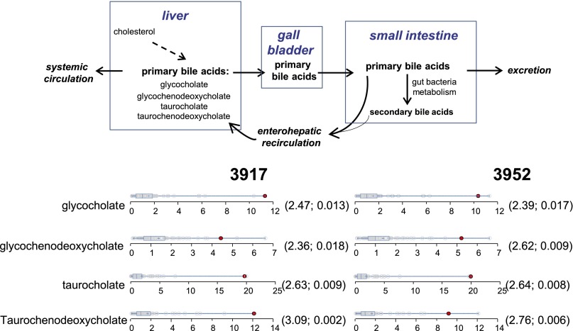
Fig. 6.
Bile acid circulation and dot plots showing data distribution in the cohort (n = 80) for the four primary bile acids. The red dots show the metabolite level for either volunteer 3917 or volunteer 3952. The open dots show the data distribution for the rest of the cohort. The box represents the middle 50% of the distribution, and left and right ‘‘whiskers’’ represent the entire spread of the data. The vertical line refers to the median, and the plus refers to the mean. An explanation of the plots is provided in the legend for Fig. 4. The first and second numbers within the parentheses are the z-score and P value, respectively.

