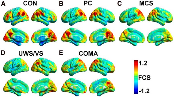
Figure 1.

A–E, Average FCS maps within the CON (A), PC (B), MCS (C), UWS/VS (D), and coma (E) groups. FCS maps of individual participants were standardized to z-scores and then averaged within each group. A hot color represents higher FCS than the global mean, and a cold color represents lower FCS than the global mean. All of the results were mapped onto the cortical surfaces using in-house BrainNet viewer software (Xia et al., 2013).
