Figure 2.

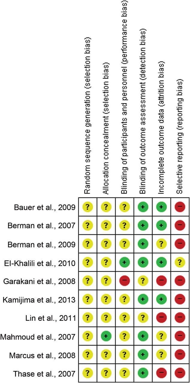
Risk of Bias Graph of Included Studies. The colors represent the quality of the studies included in this meta-analysis: red for high risk, yellow for uncertain, and green for low risk. The overall risk is unclear.

Risk of Bias Graph of Included Studies. The colors represent the quality of the studies included in this meta-analysis: red for high risk, yellow for uncertain, and green for low risk. The overall risk is unclear.