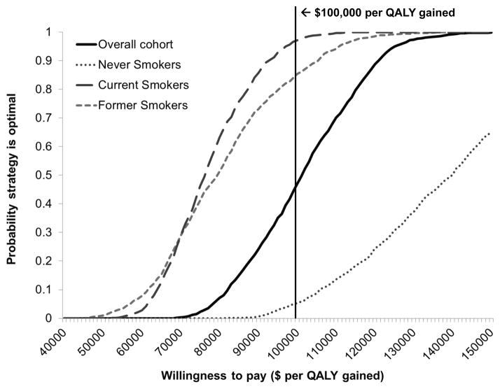
Figure 5. Cost-effectiveness acceptability curves for the overall cohort and smoking subgroups.
To illustrate the uncertainty surrounding ICER estimates, the cost-effectiveness acceptability curves depict the probability that a given strategy is the preferred strategy across a range of cost-effectiveness ratios. Results are depicted for the overall cohort (black solid lines) and subgroups, including never smokers (grey dotted line), current smokers (grey long dashed line), and former smokers (grey short dashed line). Results are based on 1000 second-order Monte Caro simulations in which model variables were simultaneously varied. The solid black vertical line indicates the $100,000 per QALY willingness-to-pay threshold commonly used as a benchmark in the US. QALY = quality-adjusted life year; ICER = incremental cost-effectiveness ratio.

