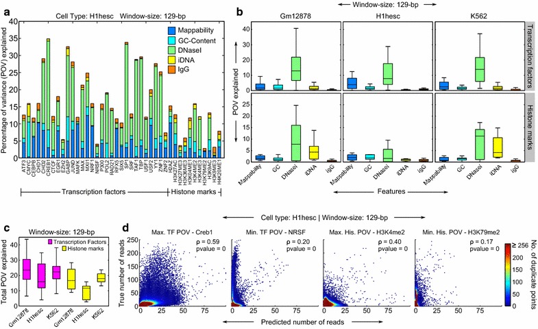
Fig. 2.

Power of different predictors for predicting the strength of the ChIP-seq signal. All plots correspond to a window size of 129 bp. a Stacked bar plot for the H1-hESC cell line showing the predictive power of different predictors in terms of the POV explained. b Box plots showing the variability in the predictive power of the predictors across datasets in a given cell line. Boxes represent the interquartile range, which measures the spread of the data. The top whisker ends at q3 + w(q3 − q1) and the bottom whisker ends at q1 − w(q3 − q1), where w = 1.5 and q1 and q3 are the 25th and the 75th percentiles, respectively. c Box plot showing the variability of the total predictive power of all the predictors combined. Data are grouped such that we have one box per combination of cell line and ChIP-seq type (TF or histone marks). d Scatter plots showing the correlations between true and predicted number of reads in individual windows for chosen cases: maximum and minimum total POV values for each of the TF and HM groups in a, all from the H1-hESC cell line. The name of the TF or HM is also indicated. For plotting purposes, the predictions were rounded to the nearest integer for consistency with the true read numbers (which are always integers). The plots have also been color coded to indicate duplicate points. This reveals large clusters at the lower left corners of the plots indicating many windows having very few to no reads. The Pearson’s rho (ρ) along with the p-values are also shown
