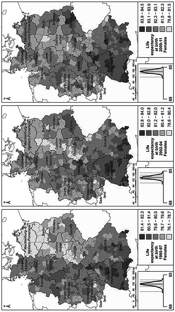
Fig. 4.
Life expectancy in 1995–1997, 2002–2004, 2009–2011. (Source: Life table calculations are based on population and death counts obtained from statistical offices of the federal states; Statistische Ämter des Bundes und der Länder 2014. Base map: MPIDR 2014). The plot left of the legend displays the density curve. In this graph the solid vertical line indicates the mean value, while the dotted vertical lines show the category breaks (based on a standard deviation classification centred on the mean)


