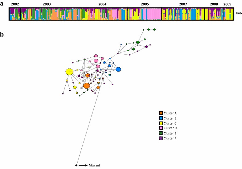
Fig. 1.

Population structure using neutral microsatellite loci. a Clustering per year using Structure 2.3. Each colour represents a different population cluster. b Median joining haplotype network. The haplotypes are represented by circles with width being proportional to their frequencies. The links are character differences and the red circles represent median vectors required to connect sequences within the network with maximum parsimony
