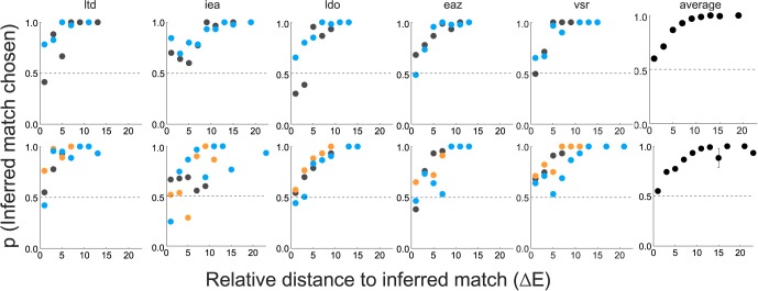
Figure 7.

Results of Experiment 2B. Proportion of trials in which subjects chose the test block that was closer to their inferred matches (relative to another competitor) is plotted as a function of the relative distance to the inferred match (see text). These proportions are binned (bin size: two ΔE units), and the bin average is plotted at the center of each bin. Each subplot corresponds to one subject with data for sets A and B in the top and bottom rows, respectively. For each set, the illuminant-constant condition is plotted in gray, the bluish illuminant-change in blue, and the yellowish illuminant-change in orange. The subplots on the far right represent the average across all subjects and conditions for each set with error bars representing ±1 SEM.
