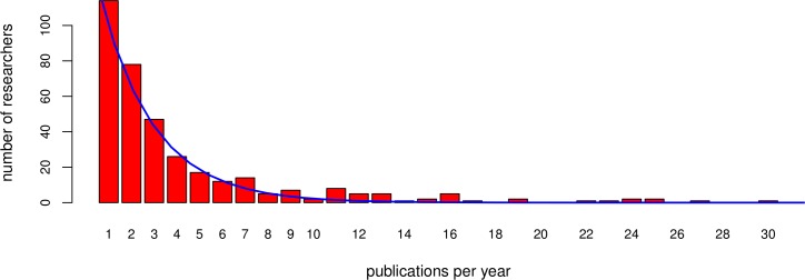
Figure 1. Publication distribution.

The sampled (bars) and fitted (line) distribution of published papers per researcher in a given year, in this case 2013. For reasons of visualisation the distribution is shown up to thirty publications, whereas the sampling sporadically included more publications per researcher. The fitted line is used as the published papers’ distribution for the simulated community.
