
Fig 2.
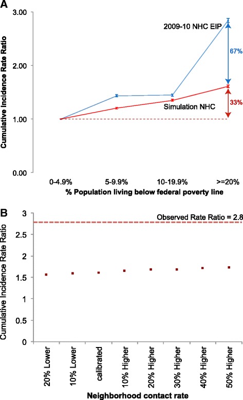
Incidence rate ratio between each higher poverty category and poverty level 1 (0–4.9 %). Blue: Emerging Infections Program data from NHC, 2009–2010. Red: simulation results for NHC (a). Sweep of the neighborhood contact rate. Dots represent the ratio of attack rates in the highest to lowest poverty census tracts (b)