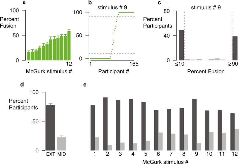
Fig. 2.

Distributions of McGurk response percentages across stimuli. (a) Mean percentages of McGurk responses for 12 different stimuli (error bars show SEMs; data from Exp. 1, Session 1). (b) Percentage of McGurk responses for Stimulus # 9 in each of the 165 participants (one symbol per participant, ordered by increasing percentages). Dashed horizontal lines show the extremes of the distribution (≤10 %, ≥90 %). (c) Percentages of McGurk responses for Stimulus 9, plotted as the percentage of participants within each 10 % frequency bin. Dark bars highlight participants in the extremes of the distribution. (d) Average percentages of participants across stimuli in the extremes of the distribution (EXT, dark bar) and the middle (>10 % and <90 %) of the distribution (MID, light bar). Error bars indicate SEMs. (e) Percentages of participants in the extremes and in the middle of the distribution for each individual stimulus.
