
Fig. 2.
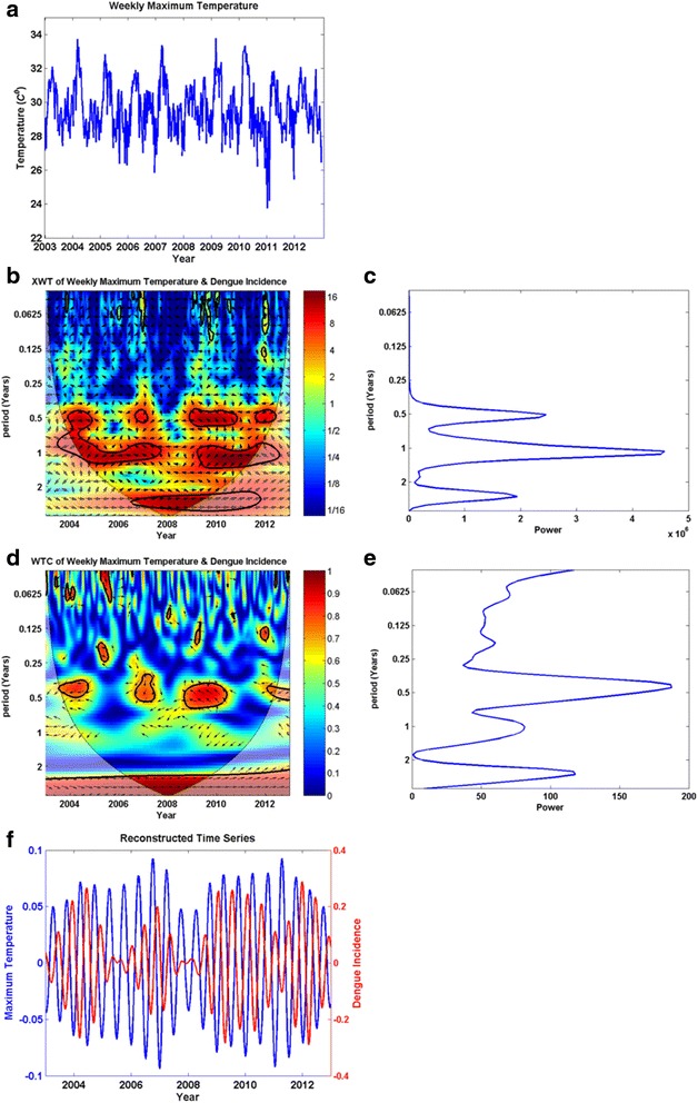
Wavelet analysis results for the maximum temperature versus dengue incidence time series as a sample (2a–2f). a Weekly average maximum temperature (x-axis: year, y-axis: weekly average maximum temperature); b) Cross-wavelet transform (XWT) (x-axis: year, y-axis: period in years); c) XWT power for each period (x-axis: power, y-axis: period in years); d) Wavelet coherence (WTC) (x-axis: year, y-axis: period in years); e) WTC power for each period (x-axis: power, y-axis: period in years); f) The time series relevant to maximum wavelet coherence is reconstructed, and shown in this figure. In Figures 2b and d, there are color codes on the right side of the main figure. These indicate the magnitude of XWT and WTC; dark blue and dark red indicate lowest and highest magnitudes respectively. The thin parabolic black line demarcates the cone of influence