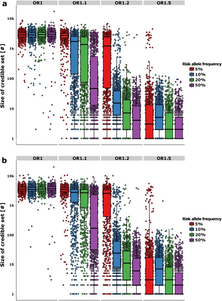
Fig 2. Refinement of the credible sets.
The y-axis shows the number of variants in the 95% (a) and 99% (b) likely credible sets. The boxplots show the median and interquartile range of the simulations, while each point denotes a single “replicate”. The color of the boxplots/points denotes the RAF of the simulated causal variant, while each panel is split by the effect size along the horizontal plane.

